The polls
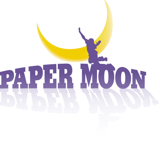
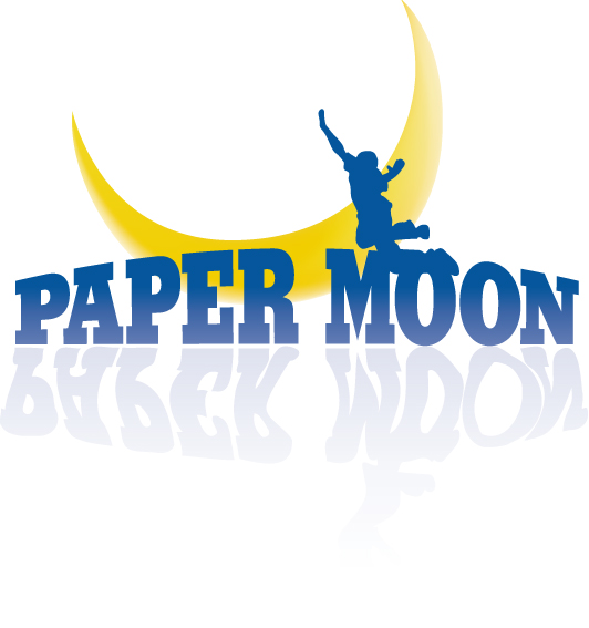
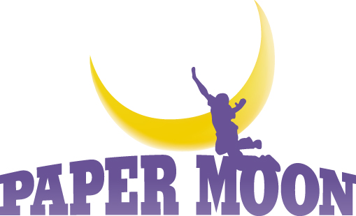
This is a logo I designed for a shop that sells children's stationery and educational toys. We (at the studio) can't decide which one to go with. They're all pretty much the same, except for the shadows. We also need some help with the colour palette. Please crit!
![]()


9 comments:
I actually prefer the one without the shadows, but if I had to choose shadows I would choose the top one. Does that make sense?
I dont like the shadows either.
I like the middle one
Okay, so majority vote so far is "no shadow". I must say I tend to agree with Adam. The effect I was going for was a reflection on some sort of body of water. (Not sure that's evident. But, hey, aren't these things usually open for interpretation?) The colour palette is what's bothering me the most. Purple is the Creative Director's choice... Maybe I'm just thinking about this too hard.
Thanks for ur comments!
P.S. Hey, Nico, wat het van jou blog geword? :)
I like the middle one - so that's two each just to make things difficult - the blue text reminds me of moonlight :)
Ek het daai blog gelos. ek gaan dalk later een op my eie begin.
ek hou van die middelste ene!!!
Well, our creative director decided to send the two purple ones in. (With and without the shadow.) We'll let the client pick.
Thanks everyone! :)
Post a Comment